The Unintuitive Power Laws of Giving |
April 1st, 2013 |
| ea |
DALYs per $1000This shows the cost-effectiveness of a large number of health interventions, with taller bars in cases where we can avert more death and suffering per dollar. The shape of this chart is important: while we can do a lot of good if we pick an intervention at random or support a 'horizontal' effort that works on everything, we can do 300 times better by picking one in the top 10%. This is why single-issue charities make sense: you can pick one that focuses on a top intervention.

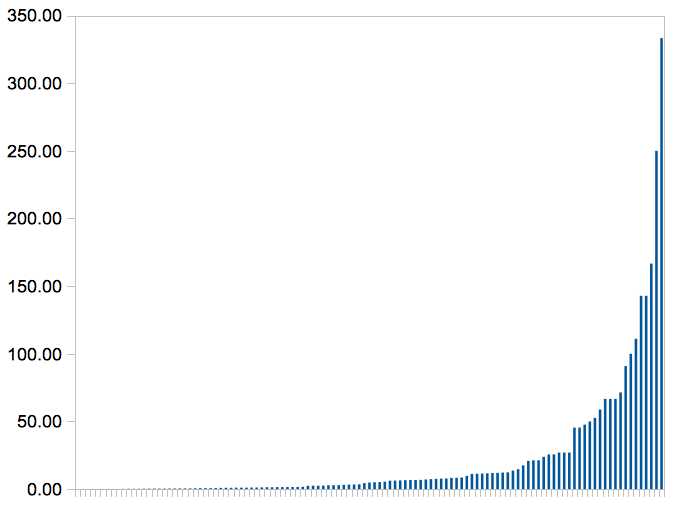
(Don't let the small bars on the left fool you: nearly every intervention on that chart is worth doing [1], some are just far more valuable than others.)
This only considers health: what about other ways of helping people? Political advocacy, development, literacy, human rights, why not them? The big thing health has going for it is that we can mostly measure impact, which lets us choose only the best options. In other fields where we can't easily measure we could end up anywhere on the impact curve.
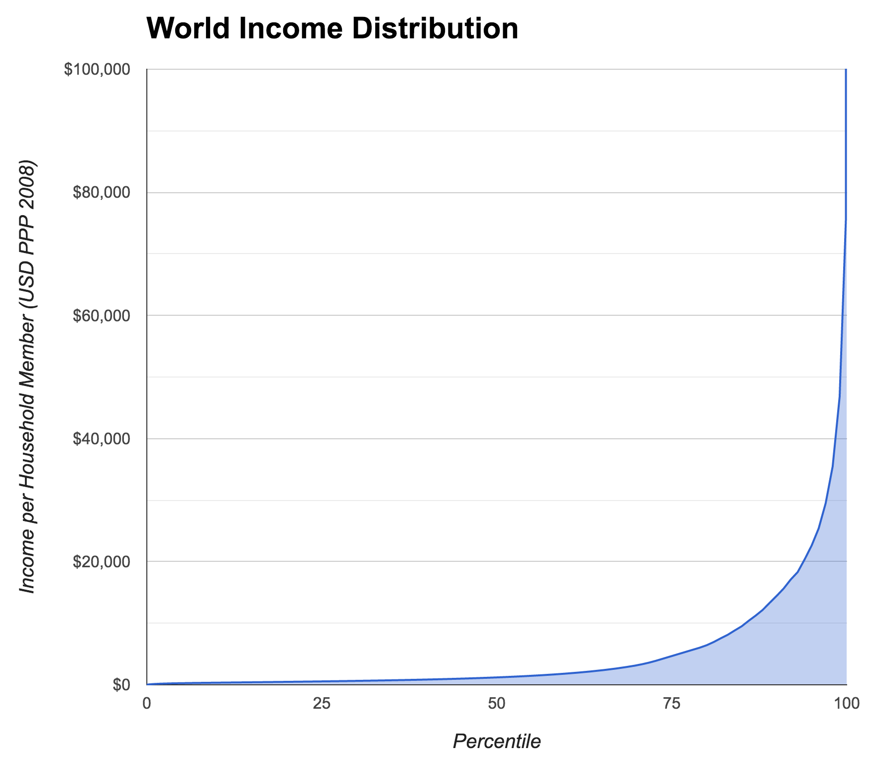
Let's look at another distribution:
So some people have a lot more money that other people, we knew that, right? But have a look at the scale. Someone earning at the poverty line in the US is richer than 90% of people. This is why giving globally is so powerful: small amounts of your money can mean a huge amount to people who have so much less.
Neither of these distributions are intuitive: we don't feel that rich, and charities all seem kind of interchangeable. But understanding them can make the difference between trying to do good and really succeeding.
(I first saw these charts in a talk by Toby Ord of Giving What We Can (GWWC). The data for the first chart, DALYs per $1000, comes from the DCP2. This was a project that, among other things, compiled cost effectiveness estimates for a very wide range of health interventions. I made the chart from the csv version of the data from here, excluding the ~60 interventions (of 171) that didn't have estimates. I made the second chart from the data that backs GWWC's How Rich Am I calculator (code). GWWC had compiled the data from the WorldBank's PovcalNet and surveys conducted by Branko Milanovic)
[1] The median intervention there is $207/DALY, which roughly means it
can give someone an extra year of healthy life for $207. Which is an
incredible deal, that I think most of us would jump at. And it's less
than 5 pixels high.
- Helping Specific People
- Identifying the Worst Charities
- Relative and Absolute Benefit
- Effective Altruism at Your Work
- The Counterfactual Validity of Donation Matching
- Effectiveness: Gaussian?
- Why Global Poverty?
- Two Distribution Graphs
Comment via: google plus, facebook, lesswrong, r/smartgiving, substack