Boston Rents 2013-2018 |
March 20th, 2018 |
| apartment_prices, boston, rent |
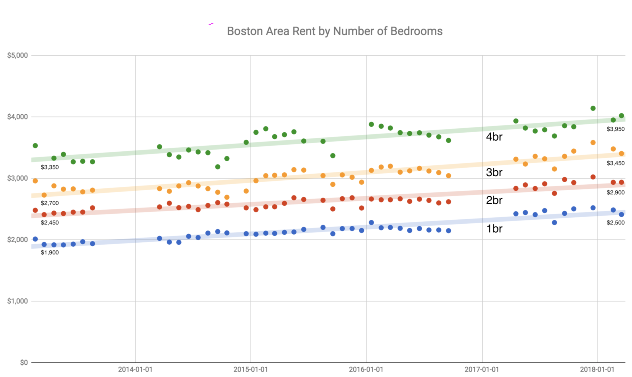
Another way to look at the same data is to figure an annual growth rate. I see:
| size | 2013-02 rent | 2018-02 rent | average annual growth |
|---|---|---|---|
| 1br | $1,900 | $2,500 | 5.6% |
| 2br | $2,450 | $2,900 | 3.4% |
| 3br | $2,700 | $3,450 | 5.0% |
| 4br | $3,350 | $3,950 | 3.4% |
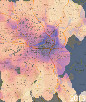
Different areas probably appreciated differently, though. Restricting to just two-bedroom units, the most frequent kind, here's an interactive view: yearly boston apartment prices. Or, if you prefer, a gif: [1]
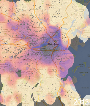
One thing you can see with these maps, compared to last time is that I'm now using the "magma" color scheme instead of a rainbow. With a rainbow some color divisions are artificially salient, like the green-yellow boundary, while "magma" and other perceptually consistent systems are uniform across their range.
I also was curious about how relative prices had changed over the past five years. Are some areas becoming more expensive (popular) relative to the rest of Boston? I've made another set of maps, these ones scaled by the average price for each year, so they're colored by whether areas are 0.5x - 2.0x of the mean for the whole map. You can see this as another map overlay or as a gif:
[1] This is similar to what I
did last time. One change is that I needed -background black
-alpha background -alpha off instead of
-alpha off -fill black -draw 'color 0,0 replace', I think
because of the new color scheme. I also moved the label in the corner
to after the compositing, so it wouldn't be artificially darkened, and
I made it larger. The new commands are:
$ convert \
   -background black \
   -alpha background \
   -alpha off
   $input \
   $intermediate_black
$ composite \
   -blend 50 \
   static-background-sm.png \
   $intermediate_black \
   $intermediate_blended
$ convert \
   -pointsize 24 \
   -fill white \
   -annotate +247+352 $year \
   $intermediate_blended \
   $intermediate_dated
Once I had all the files, I put them together in a gif. I repeated the last file twice so it would stick around longer; I don't know if there's a better way to represent this in a gif:
$ convert \
   -loop 0 \
   -delay 50 \
   *.dated.png \
   2017.dated.png \
   2017.dated.png \
   2013-2017-boston-apartment-prices.gif
Comment via: google plus, facebook, substack