Apartment Prices Over Time |
August 6th, 2013 |
| boston, housing, map |
cron job to log apartment prices:
$ crontab -l
02 02 18 * *         python /home/jefftk/query_padmapper.py
I now have seven months of data. I've updated the main map to let you click forward and back and compare months, but I also thought an animated gif would be a good way to show these changes:
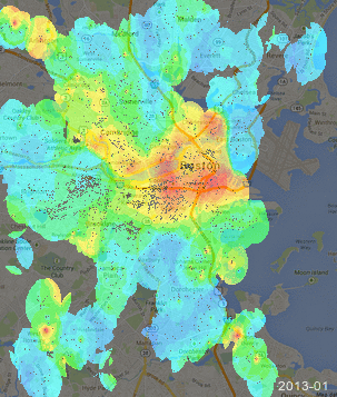
The pattern seems to be pretty consistent, without much drift overall or between areas. The main changes month to month are which areas the heatmapper decides it has enough data to draw and small red circles that show up on only one month. These are both cases where we don't have enough data, so I like how the how the gif makes it easy to focus only on what's broadly consistent month-to-month and pull out the general price structure of the area.
(If you're not interested in how to use imagemagick to make gifs like this, you could stop reading here.)
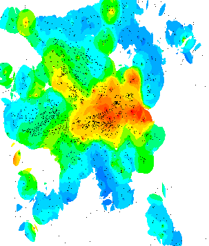
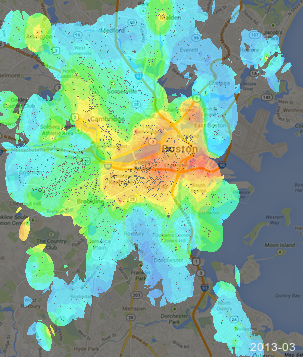
To make these maps from the data I'd logged I ran draw_heatmap.py to make seven images like this:
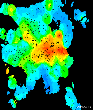
Then I ran convert over them to remove the alpha channel,
change the white background to black, and add a label in the lower
right:
$ convert \
    -alpha off \
    -fill black -draw 'color 0,0 replace' \
    -pointsize 12 -fill white -annotate +250+351 2013-03 \
     apts-2013-03-18.txt.room.303.png \
    apts-2013-03-18.txt.room.303.labeled.png
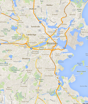
I took a screenshot of the relevant area of google maps to combine the images with, and scaled it down 50% to 303x357:
Then I ran composite to combine these images 50-50:
$ composite -blend 50 \
    static-background-sm.png \
    apts-2013-03-18.txt.room.303.labeled.png \
    apts-2013-03-18.txt.room.303.labeled.blended.png
Then I combined them into a gif:
$ convert \
    -loop 0 \
    -delay 50 \
    apts-2013-0*.txt.room.303.labeled.blended.png \
    boston-prices.gif
Giving us the gif I included above.
Working by myself on the command line I'm nowhere near this tidy. Before cleaning it up to post I had just one long command:
$ for x in apts-2013*.txt.room.303.png ; do convert -alpha off -fil
l black -draw 'color 0,0 replace' -pointsize 12 -fill white -annota
te +250+351 $(echo $x | sed s/apts-// | sed 's/-[0-9][0-9].txt.room
.303.png//') $x ${x/.png/.labeled.png} ; composite -blend 50 ${x/.p
ng/.labeled.png} static-background-sm.png ${x/.png/.labeled.blended
.png} ; done ; convert -loop 0 -delay 50 apts-2013-0*.txt.room.303.
labeled.blended.png boston-prices.gif
Comment via: google plus, facebook, substack