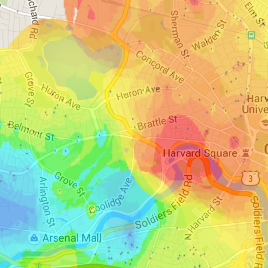
Gaussian Apartment Price Map |
February 12th, 2016 |
| housing, map |
And here's what it looks like now:
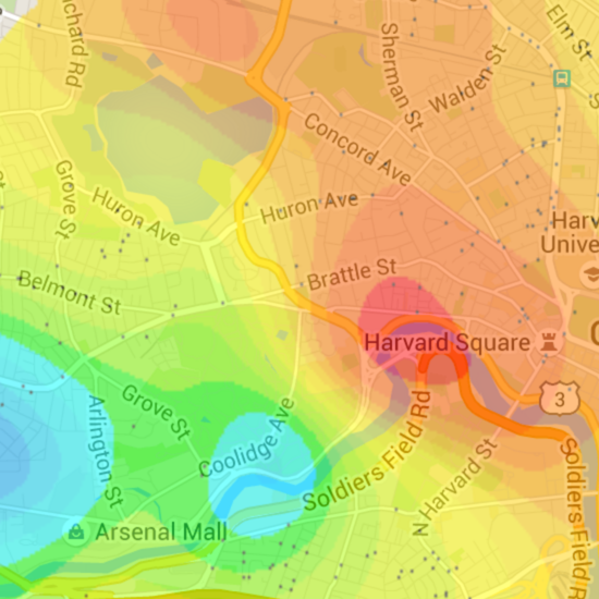
new version, live
The basic problem of the map is that I have a large number of samples (points with prices), and I want to make predictions for what new samples would be if I had them. Then I can color each pixel on the map based on that prediction.
People say location matters a lot in prices, but imagine it really was the only thing. All units would be the same size and condition, and furthermore say all units would be listed at exactly the right price for their location. In that case the advertised price you'd see for a unit would be a completely accurate view of the underlying distribution of location values.
In the real world, though, there's a lot of noise. There's still a distribution of location value over space, everyone knows some areas are going to cost more than others, but some units are bigger, newer, or more optimistically advertised which makes this hard to see. So we'd like to smooth our samples, to remove some of this noise.
When I first wrote this, back in 2011, I just wanted something that looked reasonable. I figured some kind of averaging made sense, so I wrote:
  def weight(loc, p_loc):
    return 1/distance(loc, p_loc)

  predict(loc):
    return average(
       weight(loc, p_loc) * price
       for price, p_loc in samples)
This is a weighted average, of all the samples, where the weight is
1/distance. Every sample contributes to our prediction
for a new point, but we consider the closer ones more. A lot more:
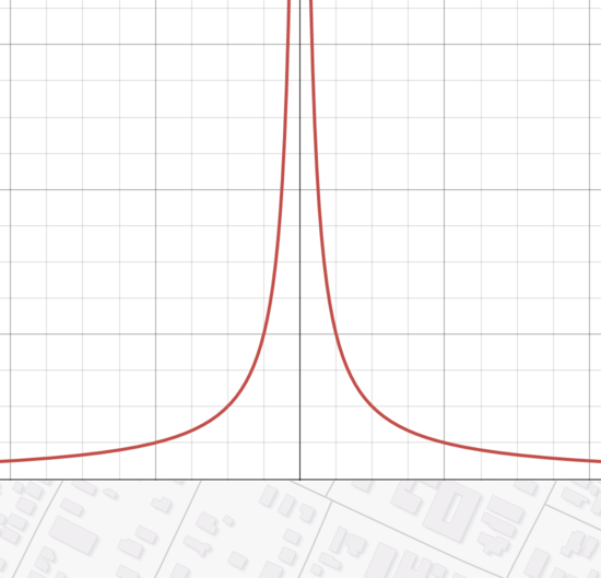
The problem is, though, if we have a sample that's very close to the point we're interested in, then the weight is enormous. We end up overvaluing that sample and overfitting.
What if we add something to distance, though? Then nothing will be too close and our weights won't get that high:
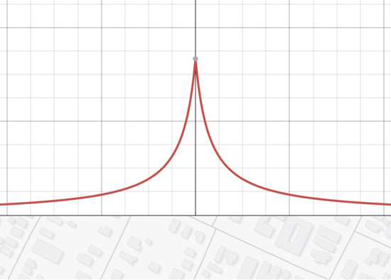
This still isn't great. One problem is that it overweights the tails; we need something that falls off fast enough that it stops caring about things that are too far away. One way to do that is to add an arbitrary "ignore things farther than this" cutoff:
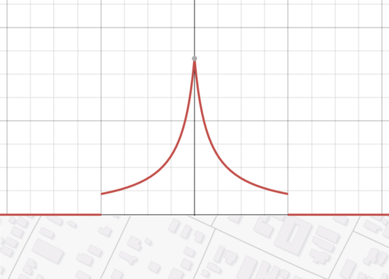
This was as far as I got in 2011, all as product of fiddling with my map until I had something that looked vaguely reasonable. At this point it did, so I went with it. But it had silly things, like places where it would color the area around one high outlier sample red, and then just up the street color the area around a low outlier sample green:
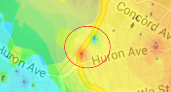
The problem is that 1/distance or even
1/(distance+a) if distance < b else 0 is just not a
good smoothing function. While doing the completely right thing here
is hard, gaussian smoothing would be better:
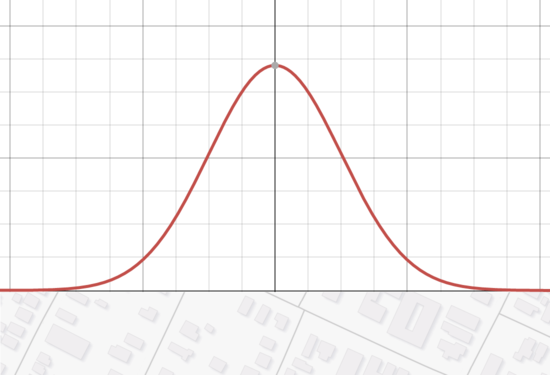
This doesn't need arbitrary corrections, and it's continuous. Good stuff.
How wide should we make it, though? The wider it is, the more it considers points that are farther away. This makes it less prone to overfitting, but also means it may miss some detailed structure. To figure out a good width we can find one that minimizes the prediction error.
If we go through our samples and ask the question, "what would we predict for this point if we didn't have any data here," the difference between the prediction and the sample is our error. I ran this predictor across all the last several years of data, and found the variance that minimized this error. Judging by eye it's a bit smoother than I'd like, but apparently the patterns you get when you fit it more tightly are just misleading.
So: a new map, with gaussian smoothing and a data-derived variance instead of the hacks I had before.
Still, something was bothering me. I've been assuming that unit pricing can be represented in an affine way. That is, while a 2br isn't twice as expensive as a 1br, I was assuming the difference between a 1br and a 2br was the same as between a 2br and a 3br. While this is close to correct, here's a graph I generated last time that shows it's a bit off:
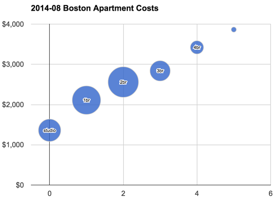
You can see that if you drew a trend line through those points 1br and 2br units would lie a bit above the trend while the others would be a bit below.
There's also a more subtle problem: areas with cheaper units overall tend to have larger units. Independence is an imperfect assumption for unit size and unit price.
Now that I'm computing errors, though, I can partially adjust for these. In my updated model, I compute the average error for each unit size, and then scale my predictions appropriately. So if studios cost 3% more than I would have predicted, I bump their predictions up. There's still just as much getting things wrong, but at least now it's not systematically high or low for a given unit size. Here's what this looks like for the most recent month:
| studio | +3% |
| 1br | -3% |
| 2br | -5% |
| 3br | -2% |
| 4br | +5% |
| 5br | +11% |
I'm still not completely satisfied with this, but it's a lot better than it was before.
Comment via: google plus, facebook, substack
