Visualizing Prediction Inaccuracy |
February 26th, 2012 |
| mbtaplot, transit |
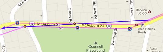
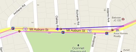
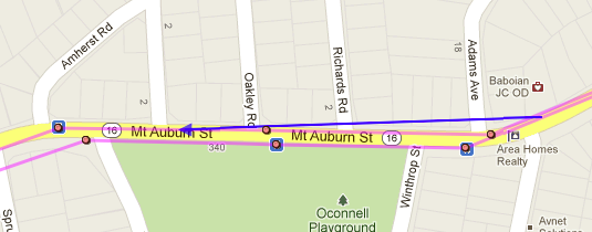
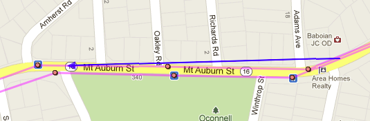
A major goal of mbtaplot is
to visualize bus predictions by converting timing information to
locations on a map. One thing I've struggled with is how to represent
information getting out of date: the longer since we last got a
position update the less accurate our estimate is. I think I've got a
good solution now, adding a line back from the prediction to the last
reported location. The longer the tail, the less sure we are about
the position:
The main thing I like about mbtaplot over nextbus or mbtainfo is that because it gives me more information I can second guess the predictions. The goal with this new feature is to intuitively convey more information about the trustworthiness of the information.
(At some point I want to figure out how to get something like this on my phone; the current version uses too much javascript for that.)
Comment via: google plus, facebook, substack