Krona Compare |
July 19th, 2024 |
| bio, nao, tech |
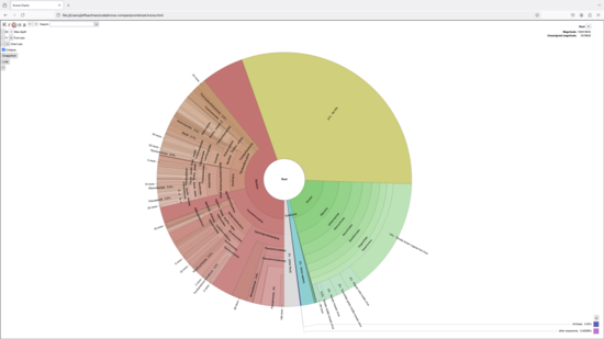
When trying to understand how metagenomic samples differ I often want to drill down through the taxonomic hierarchy, comparing relative abundances. I've tried several tools for this, existing and custom, and haven't been all that happy with any. For most purposes, the tool I like most is Krona, which shows an interactive chart. For example, here's Krona showing the results of running the NAO's v1 metagenomic sequencing pipeline on the unenriched Hyperion Treatment Plant samples from Rothman et al. 2021:
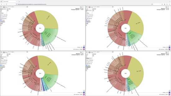
What I often wish I had, however, are linked Krona charts, where I could see multiple samples at once, and drilling down in one sample showed the corresponding portion of the other samples. After failing to find something like this, I hacked something together by monkey-patching the output of Krona. Here's it comparing the samples from several wastewater treatment plants in the same study:
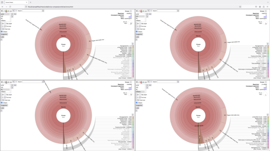
When I click on "viruses" in any of the plots, all four zoom in on the viral fraction:
That's a lot of Tobamovirus!
I only just made this, so it's likely buggy, but if that doesn't put you off you're welcome to give it a try. The interactive version of the charts above is here (warning: 60MB) and the generation code is open source, on github.
If you're interested in the technical details of how I made this:
It's a wrapper around the
ktImportTaxonomycommand from KronaTools.To get multiple charts on the same page, they're each in their own
iframe, viasrcdoc.There is unfortunately no CSS way of saying "please lay out these rectangles to take up as much of the viewport as possible while maintaining an aspect ratio close to 1:1", so I use some awkward JS. It checks each possible number of columns and takes the one that maximizes the minimum dimension (width or height) of the charts. Luckily there are only a few options to consider.
So that the colors match between the charts, each chart on the page has the data from all the charts. I reach into each
iframeto set the dataset dropdown'sselectedIndexand callonDatasetChange. It's not ideal needing to duplicate the Krona output for each pane in the HTML source and then in the rendered DOMs, but I don't see another way to keep the colors matching.To intercept navigation, the wrapper rewrites the KronaTools HTML output to hook
navigateForwd,navigateBack, and, especially,selectNode. It inserts some code that reaches into all of the otheriframes on the page and navigates them equivalently.Duplicating
selectNodeis a little tricky because normally it takes aNodeas an argument, but that's not equivalent between charts. So I walk up to the root of the tree and then depth-first search until I find a node with a name matching the intended target.It's all quite heavy, with the Rothman et al. (2021) screenshot above coming from a 60MB HTML file, but it's fast enough on my computer to be useful to me.
Comment via: facebook, lesswrong, mastodon, substack


