Two Distribution Graphs |
April 30th, 2016 |
| math, stats |
He showed two graphs to illustrate this:
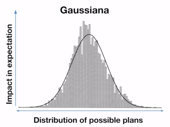
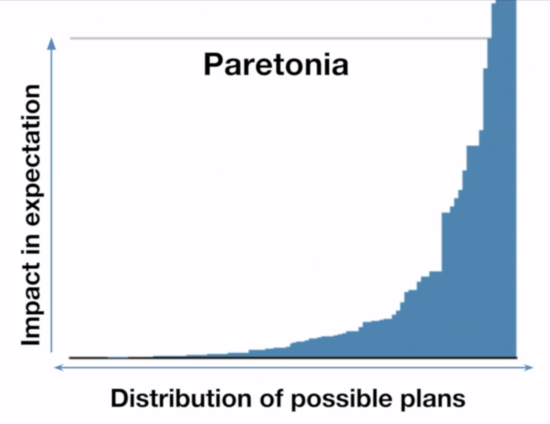
These two graphs are how people commonly visualize these two distributions, but they're not equivalent graphs. The Pareto graph axis labels are correct, [2] but on the Gaussian graph the x-axis should be labeled "impact in expectation" and the y-axis should be labeled something like "probability". But what are these different ways of looking at distributions?
The Pareto graph above is the kind of graph where you line up all your samples from lowest to highest. These are great graphs for non-statisticians trying to understand this sort of data, and are a discrete (and sideways) kind of CDF. The Gaussian graph is a histogram (the bars) plus a probability density function (the line).
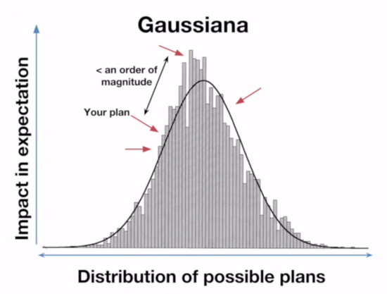
What this means is that on the Paretonia graph the bar heights represent how good the outcome is, while on the Gaussiana graph the bar heights represent how frequent an outcome that good is. When he showed what moving from a random plan to the best outcome looked like on the Gaussian graph, he was actually showing what it looks like to go from a random outcome to the most common outcome.
Let's generate some synthetic data, one Pareto and one Gaussian [3], and see what that looks like:
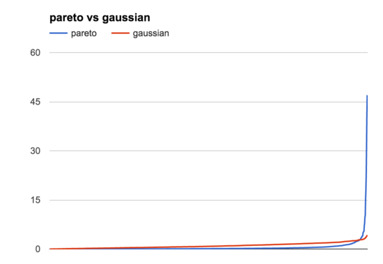
This graph shows all the samples, from lowest to highest, like the Paretonia graph above. You can see that these are very different distributions, but they have similar basic shapes: lots of lower samples, a few higher ones. Zooming in on the bottom half of the graph by hiding samples >5 (the 13/1000 highest Pareto samples) we can see this more clearly:
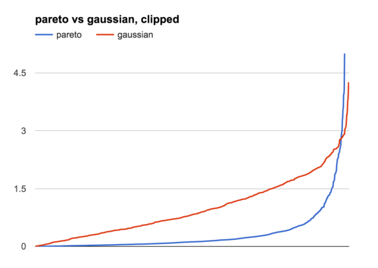
The main difference is that the Pareto distribution is much more uneven than the Gaussian one, where the very highest samples are just so much bigger than the rest. This is where the histogram view is helpful:
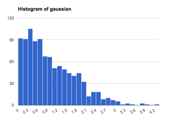
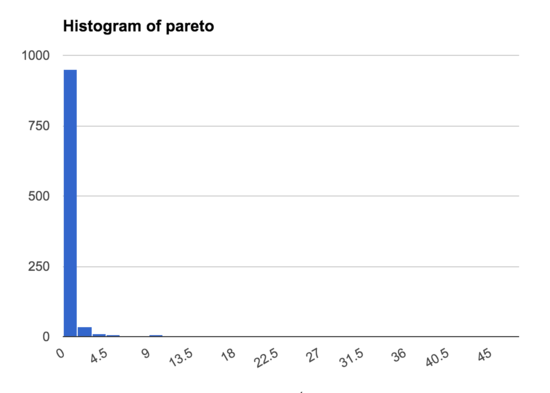
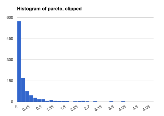
This shows that in the Gaussian distribution there is a wide range of samples, and only a small number that are much bigger than the rest, while in the Pareto distribution nearly all the samples are concentrated in a narrow band, with just a few samples much higher than the rest. This is even true if we make a histogram excluding the 13/1000 samples >5:
Overall, these are two kinds of graph are both very useful ways of visualizing a set of samples, and I typically generate and examine both when trying to understand a dataset.
(His point was still correct, however: in a Pareto universe it really is much more valuable to identify the very best options.)
[1] I also talked about Ord's argument in my post on the unintuitive power laws of giving, and after the
conference there was more discussion about Hanson thought there was more disagreement than there actually was.
[2] Though the y-axis does look clipped.
[3] Specifically, I'm going to compare a half-normal distribution (the positive half of a Gaussian distribution centered on 0) with an 80-20 Pareto distribution (alpha = 1.161), where both have a mean of 1. Here's the code I used:
import numpy as np
from math import sqrt, pi

def sample_pareto(mean=1,
                  alpha=1.161,
                  samples=1000):
  # mean is
  #  (alpha * scale) / (alpha - 1)
  # which means:
  scale = mean * (alpha - 1) / alpha

  return np.random.pareto(
    alpha, size=samples) * scale

def sample_gaussian(mean=1,
                    samples=1000):
  # mean is sigma * sqrt(2) / sqrt(pi)
  # which means:
  sigma = mean * sqrt(pi) / sqrt(2)

  return [abs(x)
          for x in np.random.normal(
              loc=0.0,
              scale=sigma,
              size=samples)]
Log normal could also make sense to compare here, but it's pretty
similar to Pareto and I'm feeling done writing.
To see the samples I generated, have a look at my scratch sheet.
Comment via: google plus, facebook, substack