Better Apartment Price Map |
October 21st, 2014 |
| housing, map |
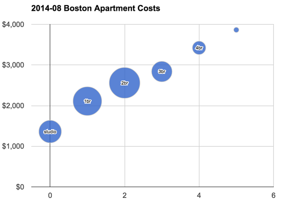
Yes, it's approximately linear, but the line doesn't go anywhere near the origin. Another way of saying this is that there's a price-preimum for having your own unit. This is the cost of a kitchen, bathroom, etc. I originally tried to handle this by eyeballing it and saying that we could count apartments as having a number of "rooms" equal to one more than the number of bedrooms, but this isn't right either. If we do a simple linear regression we see an intercept of $1,526 and a slope of $481/bedroom. The intercept is the cost of a studio or "0br" and the slope is how much each additional bedroom costs $481, on average, over the whole Boston area.
To fix this, I've updated the map generation to work in two steps. First it considers all the data, runs a linear regression, and determines the slope and the y-intercept. As before, the slope is the marginal cost of a bedroom and the y-intercept is the cost of a studio. Then it finds the x-intercept, which is the number of "phantom bedrooms" it needs to add to each listing in order to get a model that will run through the origin. This is assuming that regardless of the cost of the apartment the price premium for having your own unit is a similar percentage, which sounds reasonable but I haven't verified. Once it has the number of phantom bedrooms it can run the modeling from before and get the colored map overlay.
I also changed the way colors are assigned. Before I spaced colors at even intervals ($1000/bedroom, $1100/bedroom, $1200/bedroom, ...) but this also reflects a bad assumption about the distribution. Even spacing would make sense if we had an approximately uniform distribution of prices over a range, but instead it's much more like a bell curve:
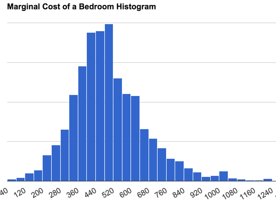
To get sufficient gradations to handle the bulk of the data in the middle while still covering the whole range we can assign colors so each color has equal area [1] on the final map. This gives gradations like:
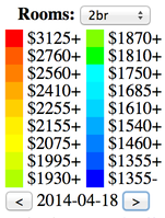
There's also a selector now where you can choose how many bedrooms you're interested in, and it will recalculate the key to take that into account. The math is relatively simple: apartment bedrooms plus phantom bedrooms, times the marginal cost indicated on the map, but it's annoying enough that you wouldn't want to do it in your head. Note that we can still use the same map image because that's colored by marginal bedroom cost; we only have to adjust the key for different apartment sizes.
So: better modeling of the data, better color buckets, and you no longer have to do math in your head. Here it is!
[1] Well, almost. There's a bug where the most expensive bucket will
sometimes go entirely unused. So some maps have no full-red. I'm not
sure why yet.
Comment via: google plus, facebook