Anthropic Density |
September 8th, 2016 |
| geo |
The problem with using people/area for density is that this represents the an average from the perspective of the land. If there are 100 people per square mile and you pick a random square mile, you should expect to find 100 people on average. But we actually care about the perspective of the people living on the land: how many other people live near you? Let's call this "anthropic density." [1]
These metrics are similar, but not the same. Consider two towns, each square, each two miles on a side, each with the same number of people:
- Town A is homogeneous, with the the people smoothly distributed over the four square miles.
- Town B has a dense center, where 90% of the people live, and the remaining 10% are smoothly distributed over the rest of the town.
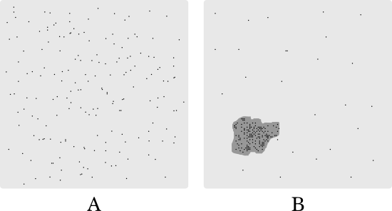
Most people in A live pretty far from other people, while most people in B live right up next to others. This means A will feel a lot less dense than B, even though they both have the same size and the same population.
When we say "how many people live near you?" we need to figure out what "near" should mean. A quarter mile feels about right to me, but this could be tweaked. Here are maps of A and B with quarter-mile circles drawn around typical residents:
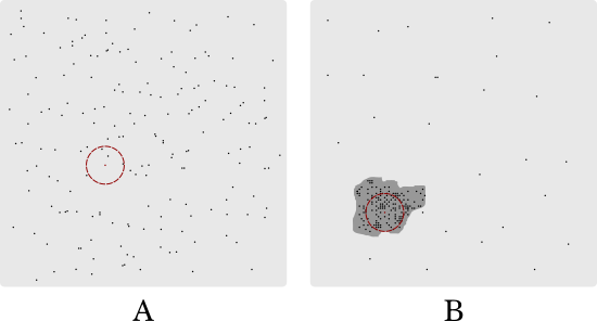
You can see that the example resident in A has three nearby neighbors while the one in B has about seventy. Now, some residents of B have very few neighbors, but on average people in B have many more neighbors than people in A.
What does this look like when applied to towns? Ideally we would have a list of all the locations of houses in towns, along with how many people lived in each, but while the census collects this they don't release it for privacy reasons. Instead they divide the country up into "census blocks" and report populations for those. I approximate population as uniformly distributed at the census block level, which is pretty good because these blocks are so small.
Here are some comparisons for the Boston-area, since I'm most familiar with this state. The first column is traditional density, the number of people per square mile of land (from boston.com), while the second is the anthropic density, the number of people within a quarter mile of each person, from the 2010 census:
| city/town | people/sqmi | avg neighbors |
|---|---|---|
| Arlington | 8,357 | 1,811 |
| Belmont | 5,362 | 1,651 |
| Boston | 12,907 | 4,396 |
| Cambridge | 16,491 | 4,379 |
| Medford | 6,970 | 2,181 |
| Somerville | 18,618 | 4,215 |
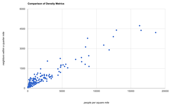
Here's a larger comparison, with traditional density on the x-axis and anthropic density on the y-axis:
Let's take the ratio of the two metrics, and look at the extremes. Here are the ones which are anthropically much lower density than we would traditionally have said:
| Hull | 21% |
| Nahant | 19% |
| Winthrop | 19% |
These are communities on spindly little peninsulas that jut out into Boston harbor:
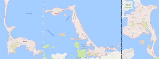
They have very little land area, so from a land-use perspective they are dense. On the other hand, people living there are mostly surrounded by ocean and not other people, so they don't feel nearly as dense as you would expect from their people-per-sqmi numbers.
At the other extreme we have communities that are anthropically much denser than we would traditionally have said:
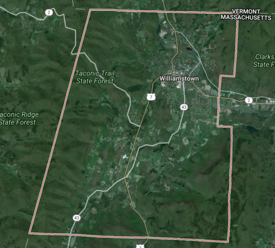
| Williamstown | 400% |
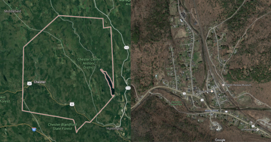
| Chester | 370% |
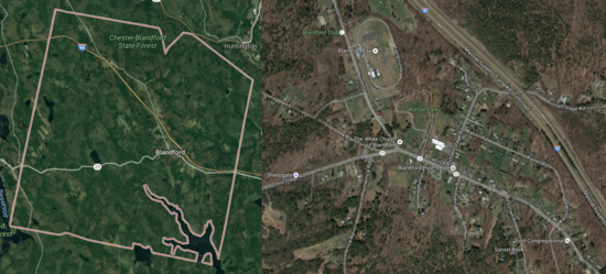
| Blandford | 280% |
Williamstown is about 45 square miles in the north-west corner of MA, but most of its people are clustered around Williams College:
Chester and Blandford, along with many other small New England towns, have populations that cluster into small town centers. They're still not very dense, but they feel more "small town" than "countryside" or "exurb".
Chester
Blandford
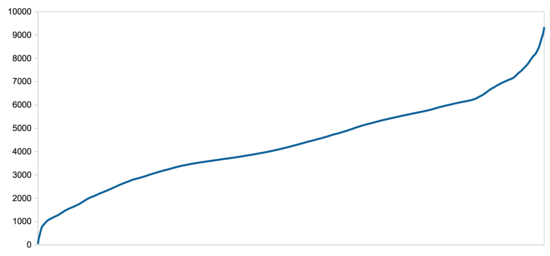
This metric also lets you look at the range of densities covered by towns. Here's a chart showing the how many people live within a quarter mile of each Somerville resident, from the most isolated to the most integrated:
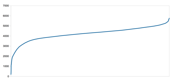
The shape of this graph, with a relatively flat line that only goes up a little at the peak, reflects the way Somerville is pretty uniformly dense. This isn't a place with a few residential skyscrapers driving up the average, but just a lot of 2-3 story houses relatively close together. The drop at the low end is because of a few people the census has as living in industrial areas like the Inner Belt. [2]
Cambridge shows a wider range of densities:
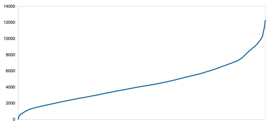
And Boston an even wider range, with a sharper peak at the high end from residential skyscrapers:
Anthropic density seems like a much better fit for what people mean when they describe an city as feeling "dense". I hope it's useful!
Technical Details
The code I used is on github. The basic problem it's trying to solve, aside from how to work with the Census' shapefiles, is that we have polygons with populations, and we are trying to calculate something that's defined at the person-level. There's probably a more efficient, and more accurate, way to do this, but I just generated imaginary people at one per unit of population. So if a census block has a population of 1000, I generated 1000 people at randomly selected locations within the block. This might sound a lot like Brandon Martin-Anderson's dotmap, because it's the same idea. They drew a dot for each person in the US and visualized population density, and I based my code on theirs.An algorithm that goes "for every person in MA, consider each other person in MA and figure out if they're within a quarter mile" is impractically slow, so I couldn't do that. Instead I divided the map up into blocks that were somewhat wider than a quarter mile, which meant that for each person I only had to consider each other person if they were within one of the nine blocks (same, left, right, up, down, diagonals) around their point. It still took about three days to run for one state on my laptop; if I wanted it to be faster I'd probably move the "compute how many neighbors each point has" step to C.
(This algorithm isn't quite right, since I'm running it on a per state basis, and so cities/towns on the borders between states will seem to have slightly lower density than they should. Really I should do this for the whole country at once.)
Density numbers for each MA town are in this sheet and the full data for MA is in this 36 MB compressed text file.
[1] Both because it's a person-focused formulation of the density, and
because it has some resemblance to the anthropic
principle.
[2] Why "Inner Belt"? If Boston had a close-in ring road it would have been called the Inner Belt and run (partly) through that area. The project was cancelled in freeway revolt, but the name stuck.
Comment via: google plus, facebook, substack