Transit Service Quality Map |
November 17th, 2010 |
| mbta, transit |
After looking at the maps
from yesterday showing how long it would take on transit to
reach various places given a starting place, I thought it would be
nice to make another map that shows the "transit service quality" in
an area. Roughly, this would mean "how long does it take me to get
places on transit starting from here?" A smart map would know that
some places are more desirable as destinations (more people want to
go to copley square than west medford square), but I'm treating all
points on the map as equally valuable. So on these maps, each point
represents the average time it would take to get to anywhere else on
the map, calculated using tillberg's maps.
Referenced in: MBTA Transit Service Quality Map Now Responsive
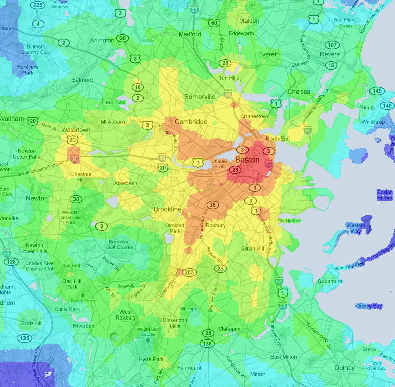


On the greyscale maps the range is 45min (white) to 117min (black). On the colored map the ranges are:
- 45-50: red
- 50-55: orange
- 55-60: yellow
- 65-70: lime green
- 70-80: green
- 80-90: teal
- 90-100: light blue
- 100-117: medium blue
If you want to do further work with these, the small greyscale one can be thought of as an array of averages of the tillberg maps, scaled to be between 45min and 117min. The other two maps necessarily have distortions from the resizing or the quantizing.
Comment via: substack